Week 36/2024
Most filmmakers will acknowledge the importance of color in film. However, only a few of them consciously use it as visual tool to express meaning. Rather than a mere stylistic choice, filmmakers like Michael Mann, John Ford and Douglas Sirk consider a film’s color palette to be part of its content.
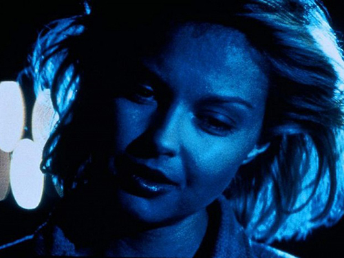
In Michael Mann’s Heat, everything seems color-coded, to the point where the color of a car will tell the viewer something about the intentions of the person driving it. Eliciting a sense of loneliness and isolation through various shades of blue, Mann’s cool palette is much more expressive than his taciturn characters.
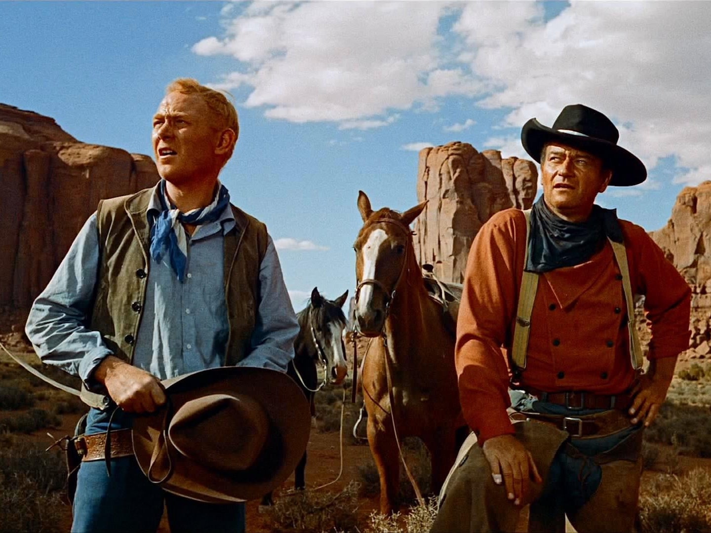
John Ford, one of Mann’s primary influences, also makes intentional use of color. In the Western The Searchers he combines the vibrant and saturated colors of Technicolor printing with the large depth of field of VistaVision to produce vast, scenic landscapes in which the golden-brown desert sand sharply contrasts with the crisp blue sky. While these technologies were primarily introduced by film studios trying to compete with television by making their films more appealing, Ford taps into their narrative potential as well, using the high-contrast colors to make distinctions between characters and scenes.
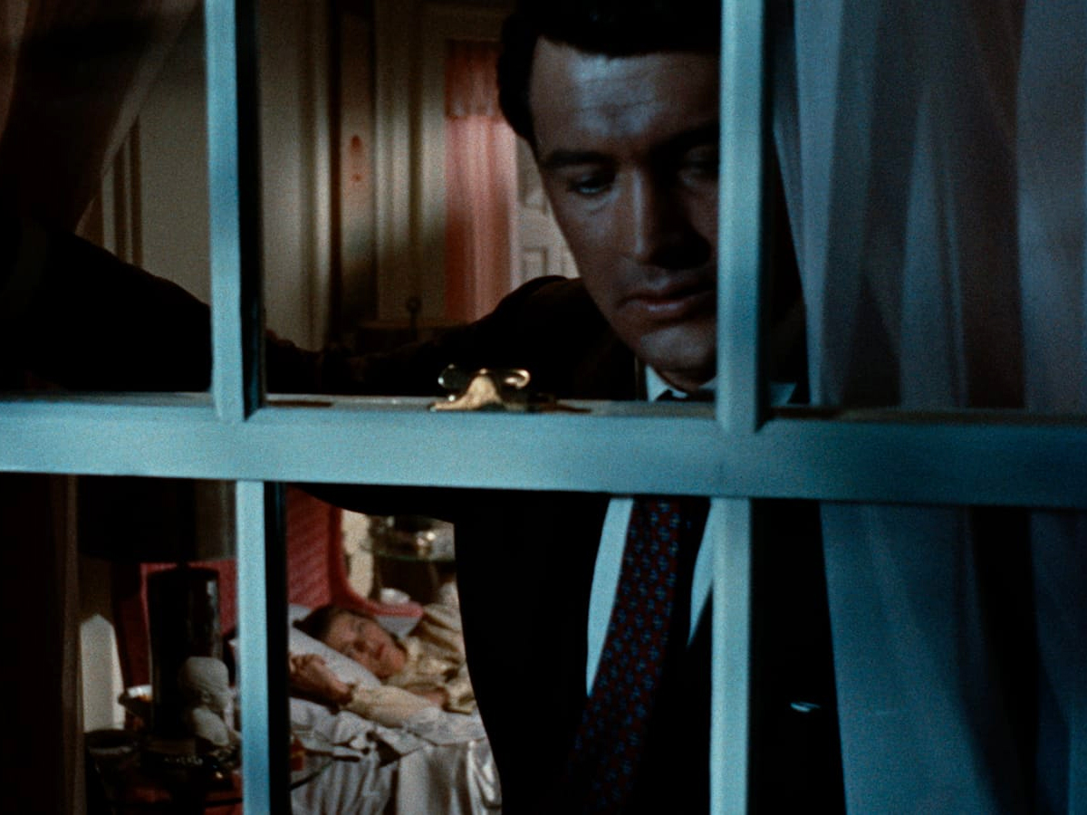
However, the most prominent colorist is undoubtably Douglas Sirk, whose so-called “technicolor-expressionism” reaches its peak in Written on the Wind. Conveying psychological states and emotions through formal cinematic elements rather than plot or script, Sirk’s use of color is an essential part of the film’s meaning. Associating each character with a specific color, intrigues are revealed to the viewer through color changes and combinations. When asked about the color in Written on the Wind, the director replied that he wanted it “to bring out the inner violence, the energy of the characters which is all inside them and can’t break through.” Female protagonists who are silenced by society are given a voice through the expressive potential of color.